


Pre-Planning Considerations for Building Self-Paced Interactives

We’ve all been halfway through the build of an interactive and have realized that something about the content or something about the original intent of the interactive simply won’t work in the template that we’ve chosen. Whether the presentation simply does not match your original vision of the interactive, or the pedagogy is lost in translation, the result is lost time and effort.
When put into perspective, however, more costly than your time spent as a designer is the impact that a poorly planned interactive can have on a learner. Content forced into an inappropriate template will ultimately not convey the material properly to the learner.
To minimize the chances of lost time and effort on the designer and the learner, you can walk yourself through some decision-making points prior to the construction of the widget.
We’ll focus on two very common sources of material: text-based and multiple mixed-media content.
Text-based Content
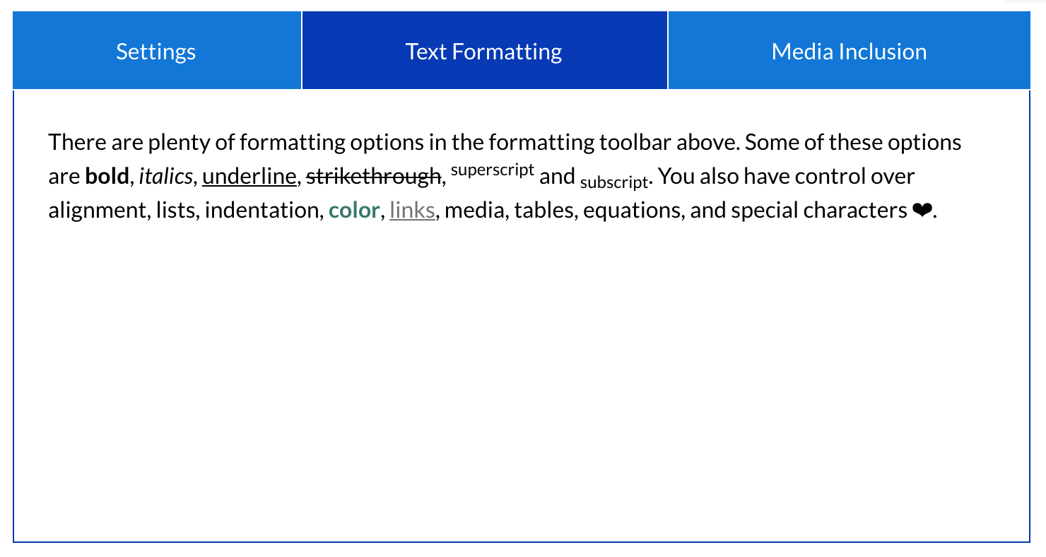
The two most popular display widget types for content that is largely text based are the Tabs widget and the Accordion widget. There are some critical visual distinctions between the two templates, as well as the important need to see all content in context that can only be achieved in the Accordion widget.
Do you need to present content with a fixed visual focal point? Should the panels be navigated with short, horizontally sequenced labels?
The Tabs widget is useful for content where:
● The intent is to keep the reader’s visual focus unchanged as each panel is revealed.
● The user controls the pace and order of information.
● Sections of content each have corresponding short labels.
● Labels for sections of content should be horizontally oriented.
● Sections of content are roughly uniform in length.
● Vertical space is at a premium, so condensing overall height is important.
● The presentation of content is comparative in nature.
Do you need longer labels affixed to each panel? Do you need the option to view panels concurrently?
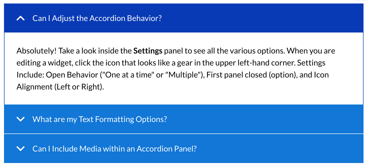
The Accordion widget with Open Behavior set to “One at a time ” is useful for content where:
● The intent is for the user to focus on each section of content individually.
● The user controls the pace and order of information.
● Sections of content each have corresponding headers.
● Sections of content are roughly uniform in length.
● Vertical space is at a premium, so condensing overall height is important.
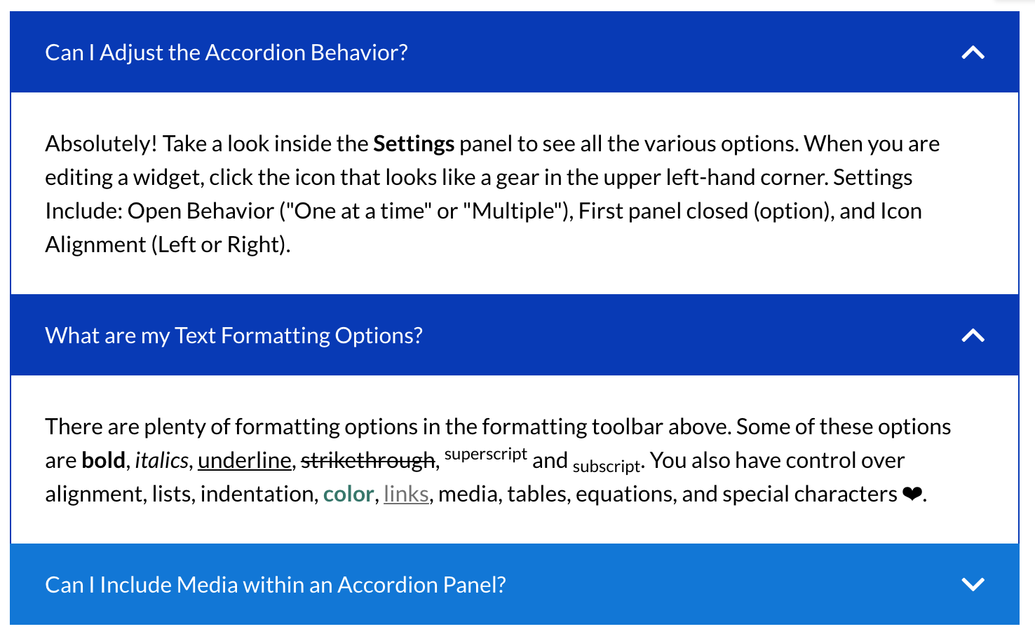
The Accordion widget with Open Behavior set to “Multiple” is useful for content where:
● The intent is for the user to focus on each section of content individually BUT the user should be able to see all sections in context for understanding.
● The user controls the pace and order of information.
● Sections of content each have corresponding headers.
● Sections of content are roughly uniform in length.
● The information contained within is supplemental, allowing the user to engage if desired.
Multiple Mixed-Media Items
You have several pieces of media, each with corresponding text. There are several different templates which can accommodate this type of content: Gallery, Hotspot, or Tabs.
Does the revelation of content need to be in a strict author-dictated linear order?
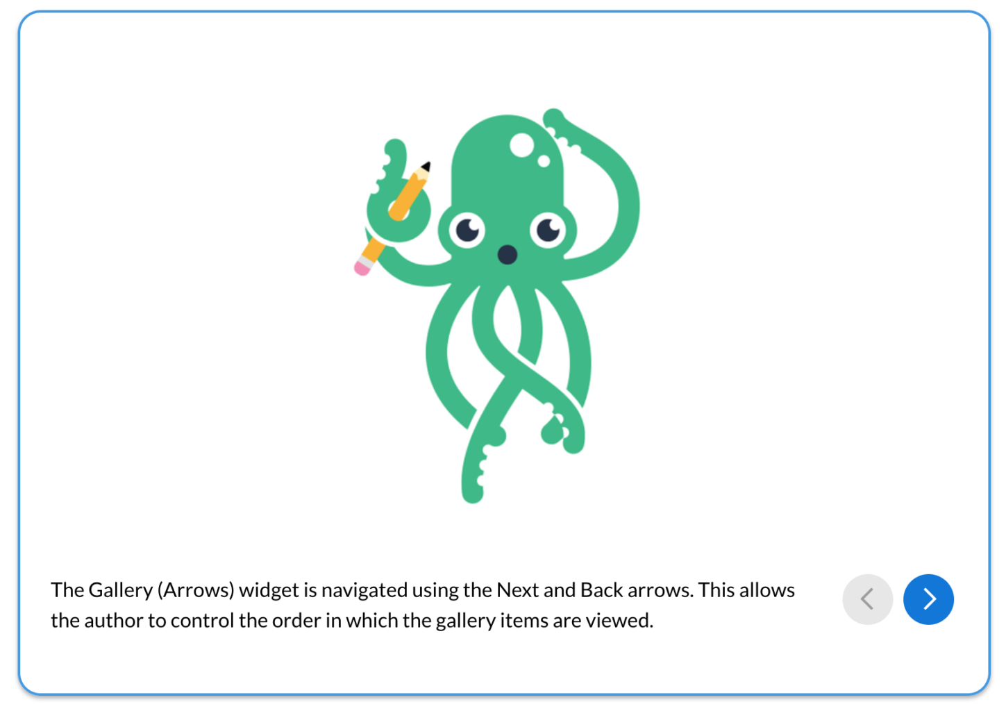
The Gallery (Arrows) widget is useful for content where:
● The author wants to dictate the order in which the gallery items are viewed.
● The user controls the pace of information.
● The order in which the gallery items are viewed is linear in nature.
● A process or diagram should be revealed one part at a time.
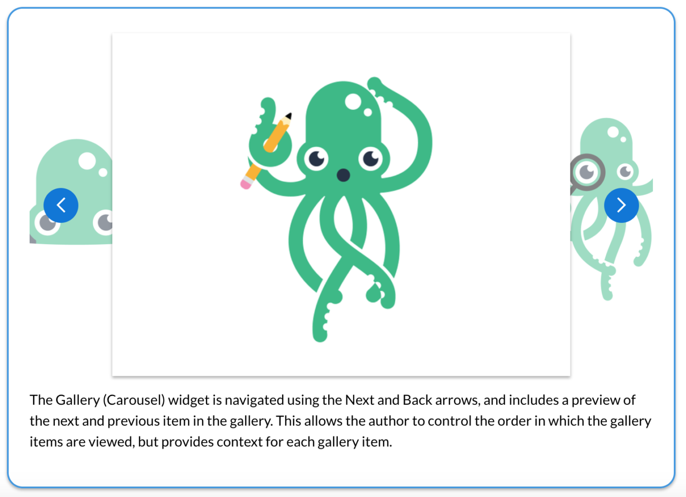
The Gallery (Carousel) widget is useful for content where:
● The author wants to dictate the order in which the gallery items are viewed.
● The user controls the pace of information.
● The order in which the gallery items are viewed is linear in nature.
● A preview of the next and previous gallery item is desired for context.
Should the user have control over the order in which the items are viewed? Should the user have a preview or reference point for each item before it is put into focus?
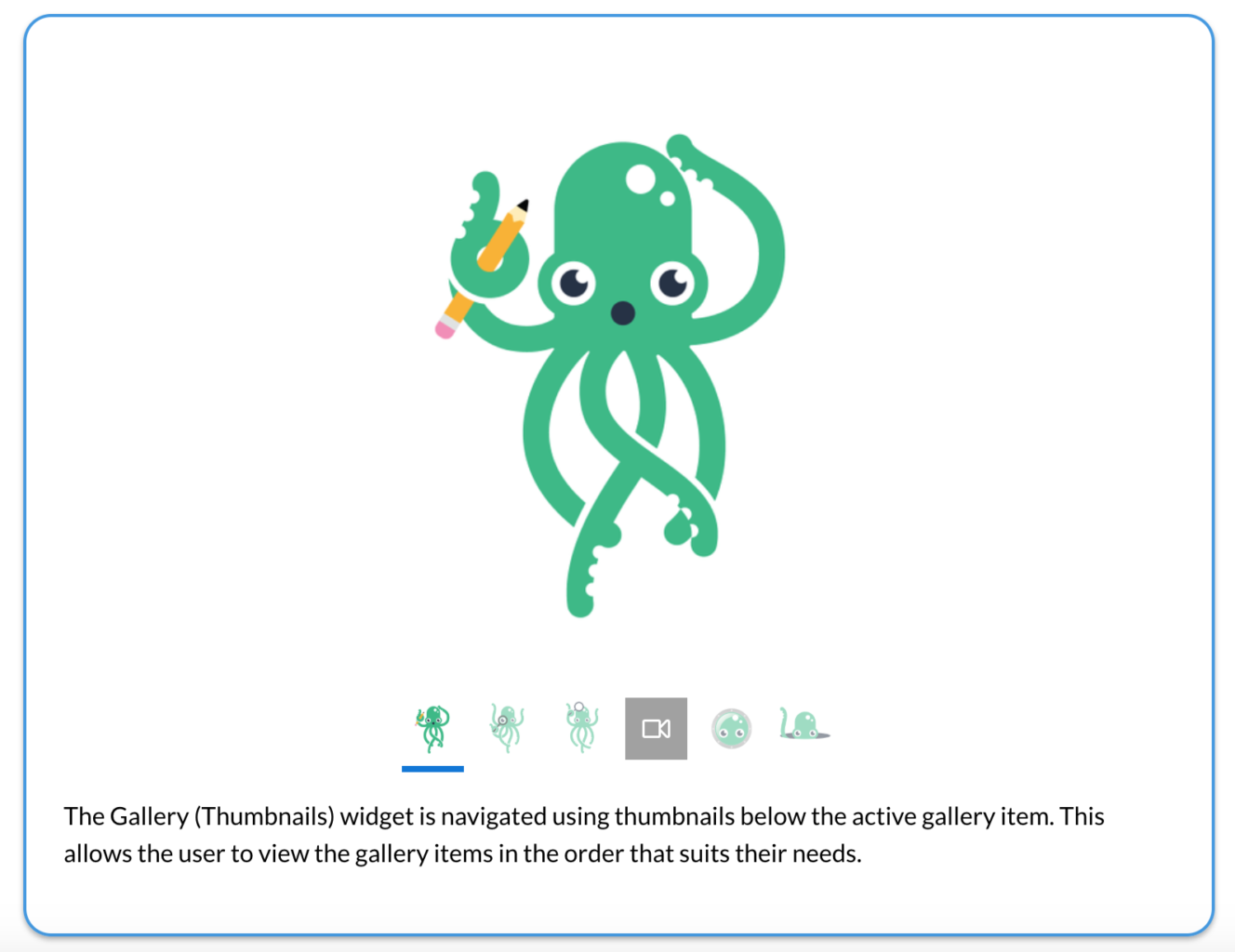
The Gallery (Thumbnails) widget is useful for content where:
● The user should be able to view the gallery items in the order that suits their needs.
● The user controls the pace of information.
● The order in which the gallery items are viewed does not need to be linear in nature.
● A thumbnail image of each gallery item is desired for context.
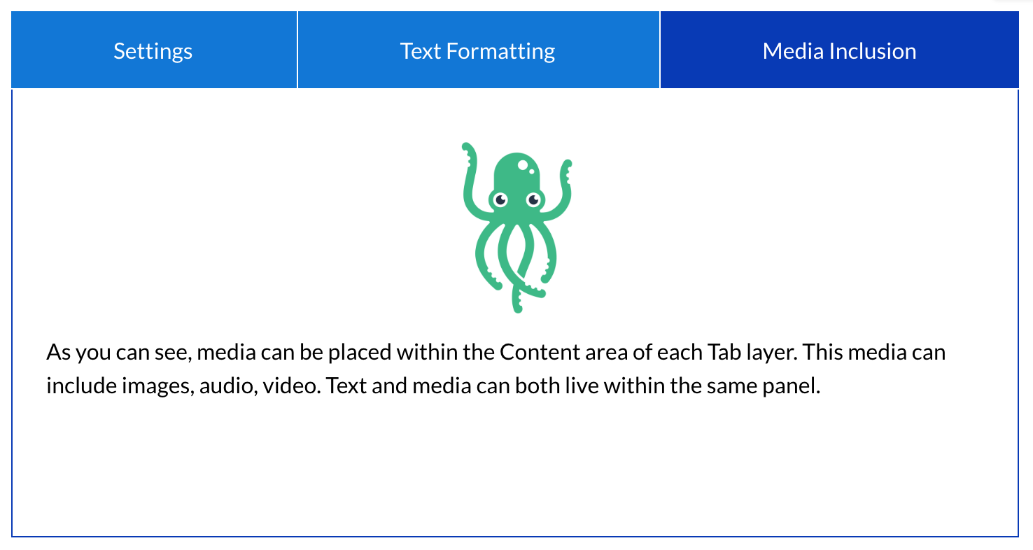
The Tabs widget is useful for content where:
● The user should be able to view the items in the order that suits their needs.
● The user controls the pace of information.
● Sections of content each have corresponding short labels.
● Labels for sections of content should be horizontally oriented.
● Sections of content are roughly uniform in length.
● The presentation of content is comparative in nature.
Do individual content items revolve around a single visual element? Does information need to be oriented in a specific physical location (x,y coordinates) in relation to a visual element? Do individual pieces of information need to be seen in a larger context?
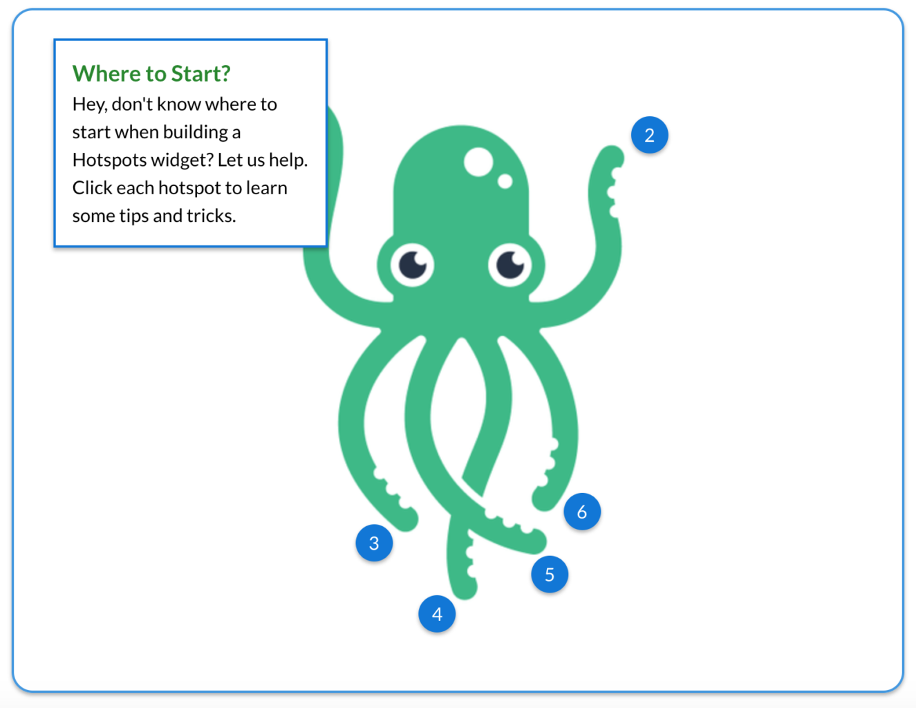
The Hotspots widget with Pop-up Style: “One at a time” is useful for content where:
● All sub-items relate to a single visual element.
● The user controls the pace of information.
● All sub-items relate to a specific physical location of a single visual element.
● The user should concentrate on the content of only a single annotation at a time.
● The amount of content associated with the hotspots make it difficult to have more than one annotation open at a time.
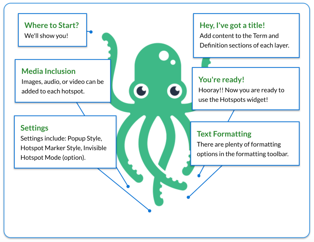
The Hotspots widget with Pop-up Style: “Concurrent” is useful for content where:
● All sub-items relate to a single visual element.
● The user controls the pace of information.
● All sub-items relate to a specific physical location of a single visual element.
● It is necessary to see all annotations in context for learning.
● The content associated with the hotspots is short in length.
● The concurrent display of the annotations results in a complete diagram.
Effective design is often a product of efficient design. By pre-planning your interactives through the perspectives of the final visual presentation as well as pedagogical intent, you can increase the likelihood that your interactives will suit the needs of the learner as well as your need for a streamlined build process. To explore a new course authoring application that will further assist in streamlining the process, schedule a tour of knowbly™.